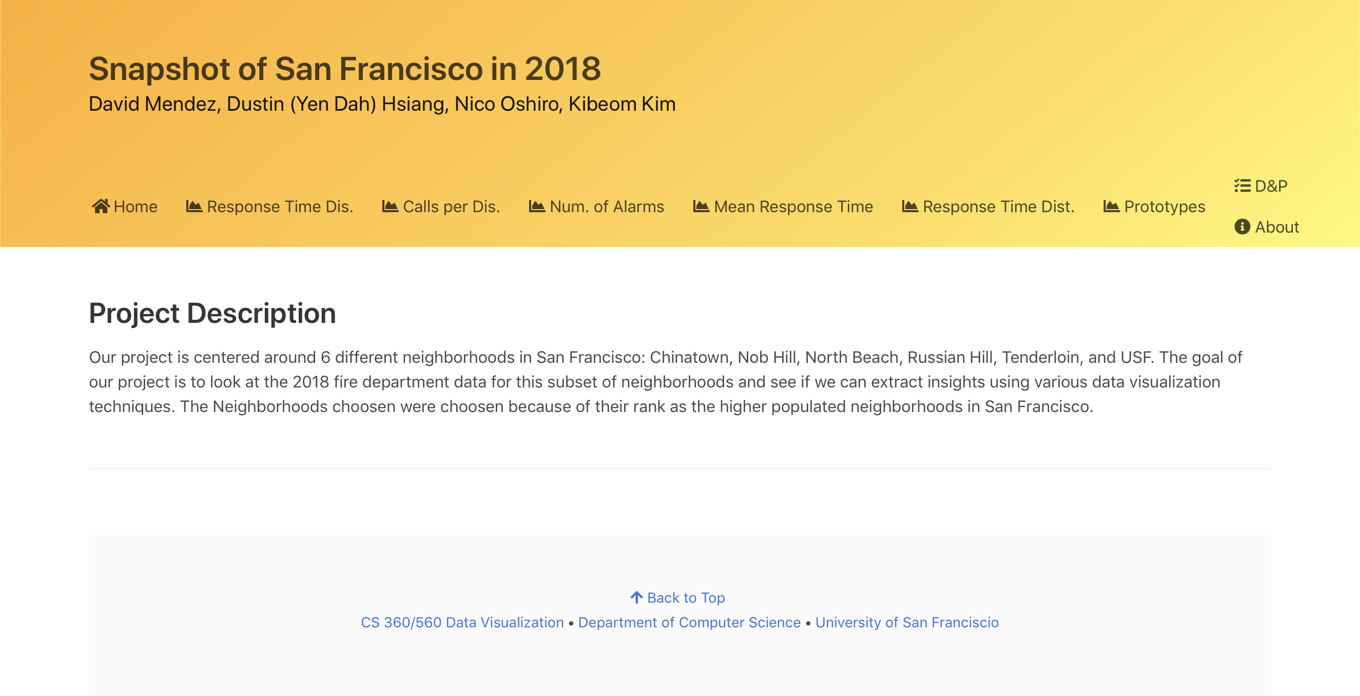
Snapshot of San Francisco in 2018
Description
Note: For academic purposes only!
Website not intended for use on mobile devices.
This is a team project I have been a part of for the CS 360/560 course in University of San Francisco which analyzes six different neighborhoods of San Francisco in 2018 based on the data from Data SF's Fire Department Calls for Service.
The website contains detailed visualizations about the Fire Department's response time, number of calls, and number of alarms.
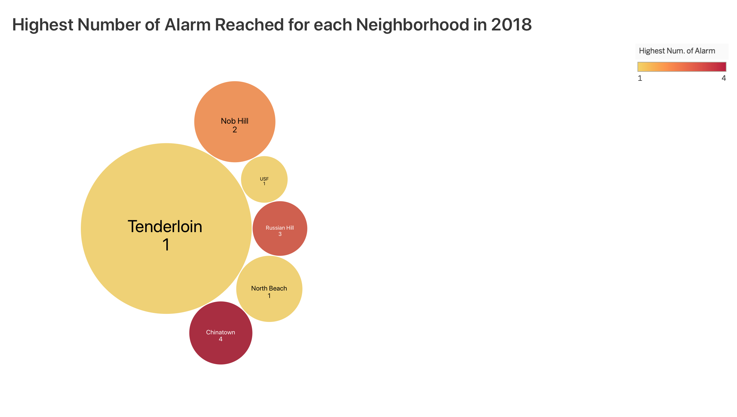
My visualization was a simple bubble chart created with D3.js about the highest number of alarms reached for each of the six neighborhoods the project analyzees. Each bubble represents one of the six neighborhoods and the size of each bubble is determined by the number of records, while the color reflects on the highest number of alarm reached. The darker the color is, the higher the number of alarm is reached, with yellow being the lowest and red being the highest. As you hover over each bubble, a tooltip shows with the total number of records of that bubble.
Teammates
and their works on the website.
David Mendez:
- Response Time & Number of Calls per Final Call Disposition
Nicolas Oshiro:
- Mean Response Time per Month
Kibeom Kim:
- Response Time to Arrive on Scene
Yen Dah Hsiang (me):
- Highest Number of Alarm Reached
Programming Language(s) Used
- JavaScript
- D3.js Library