San Francisco Offensive Incidents 2003 vs. 2018
Description
Note: For academic purposes only!
Website not intended for use on mobile devices.
This is a data visualization project that I've created for the CS 360/560 course at the University of San Francisco.
This visualization is created by using the D3.js JavaScript library and the data processed from San Francisco Police Reports of Data SF.
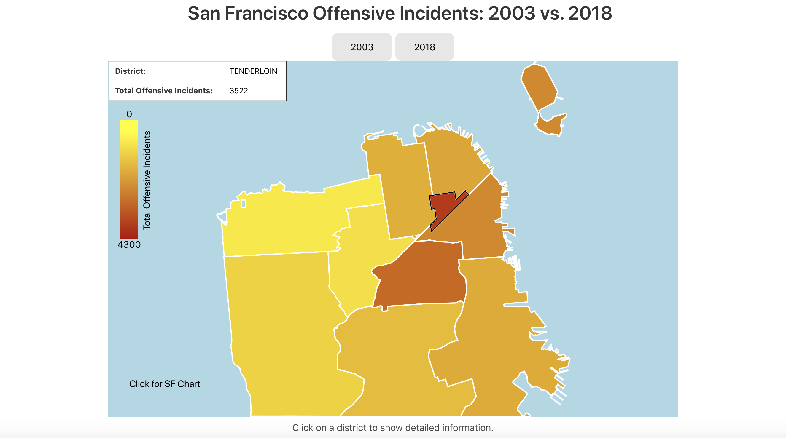
The choropleth map shows the number of offensive incidents in San Francisco by police districts. The color gradient for each district reflects the number of offensive incidents there and the darker the color, the higher the incident count (yellow meaning fewer and red meaning more).
The two buttons, 2003 and 2018, on top of the map allow the user to compare between the first year such police reports were made available and the most recent complete year.
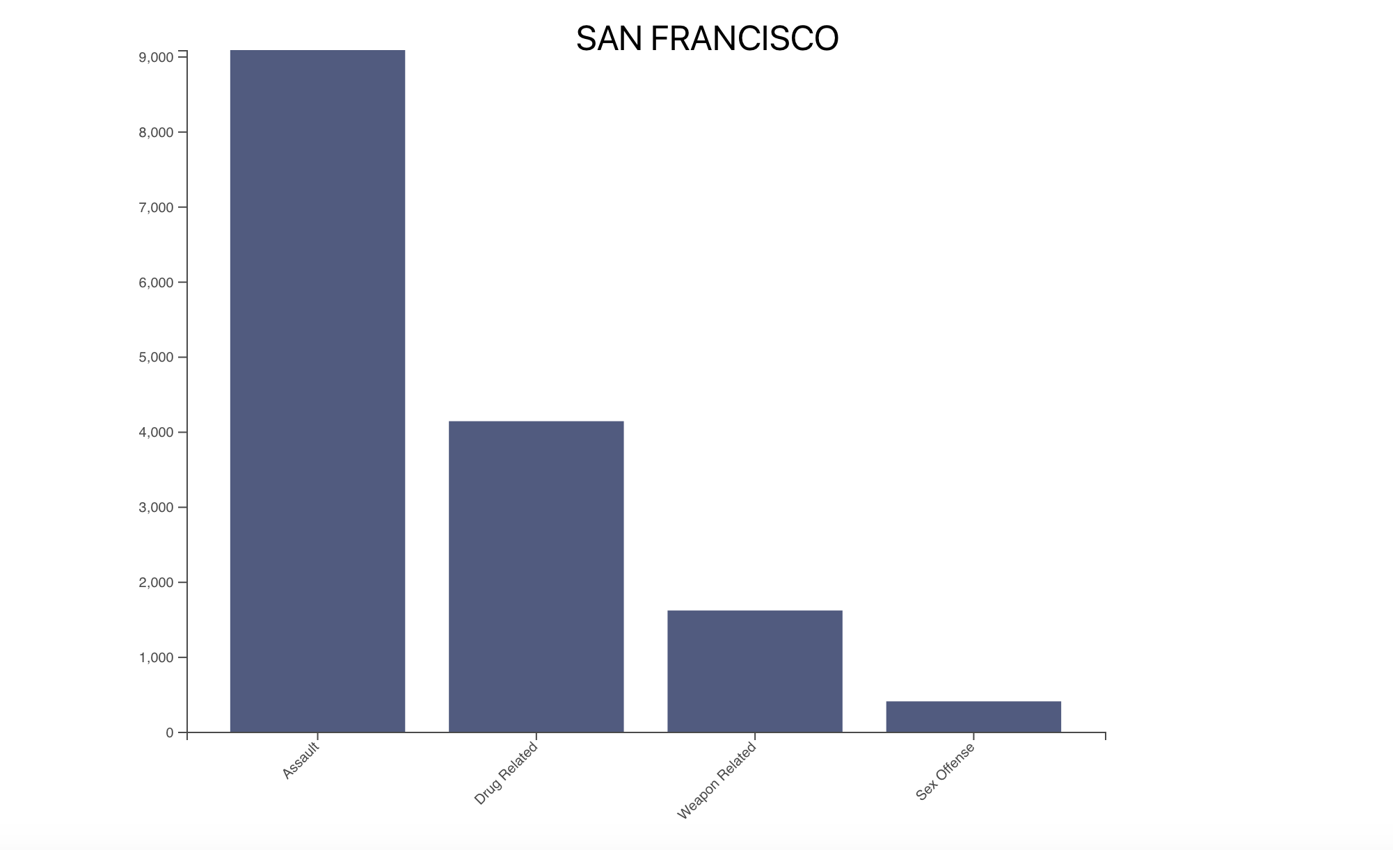
The bar chart below will update with data from the specific district selected by the user, providing detailed information on specific offensive incident types including: Assault, Drug Related, Sex Offense, and Weapon Related.
Programming Language(s) Used
- JavaScript
- D3.js Library